Color is the fastest language in style. Long before a cuff or collar speaks, hue and value send a message. In 2025’s busy, screen-heavy world, color is a tool that helps you show up with clarity. The aim of color psychology in styling is not to manipulate but to support the mood, context, and outcome you want. Think of your outfit as a headline; color chooses the font size.
Start with temperature. Cool tones often communicate professionalism and calm; warm tones radiate approachability and energy. A navy blazer frames you as reliable and grounded. A terracotta knit says you are open and warm. Neither is better. The question is which message fits the moment. When clients lead high-stakes calls, we lean on cool blues and charcoals. For community events or creative meetings, a warm accent can be the handshake that softens the room.
Value—lightness versus darkness—adds contrast that guides attention. Light colors lift and expand; dark colors anchor and refine. A light shirt under a dark jacket brings attention to the face. Head-to-toe dark creates a column that elongates and quiets. Mid-tones blend and feel relaxed. When you want your words to land, keep the area around your face lighter or higher contrast. If you prefer to observe, soften the contrast and let texture take over.
Saturation controls volume. Highly saturated colors shout; muted tones converse. A saturated emerald dress at an evening event states presence without apology. A muted sage shirt in a team meeting feels calm and collaborative. Many people assume they need a closet of brights to feel confident. In practice, one saturated piece can do the heavy lifting while the rest of the outfit whispers.
Beyond message, color affects you physically. Some shades lift energy, others reduce it. Clients who run anxious often thrive in cooler, grounded palettes—navy, slate, forest. Those who need an energy boost keep a bright accessory on standby: a scarf in mandarin orange or a cobalt belt. When you are unsure what the day demands, bank on neutrals that love each other and add a single accent near the face.
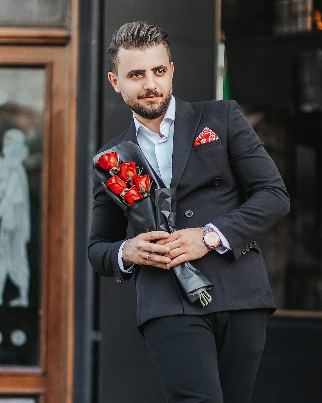
Consider cultural and contextual nuance. In corporate settings, deep blues and charcoals telegraph stability. In creative industries, unusual pairings feel intentional: rust with lilac, olive with blush. Across many contexts, red is complicated. It can be motivating or aggressive depending on the design and the environment. If red excites you but feels loud at work, use red as a micro-accent—lip color, nail polish, a slim belt—or choose a softer relative like garnet or brick.
Build palettes you can rotate. Start with three neutrals that mix easily, then add one accent per season. A cool palette might be charcoal, ice grey, and optic white with a cobalt accent. A warm palette could be camel, cream, and espresso with rust. Choose metals that harmonize. Silver and gunmetal flatter cool palettes; gold and bronze flatter warm ones. Rosy metals bridge both.
Complexion matters less than people think. While undertone guidance can help, the bigger win is placement. If a color fights your skin tone, keep it away from your face. Let it live in trousers, shoes, or a bag. Keep your near-face area within your harmony, then experiment freely below the waist.
In practice, color psychology is a series of small, readable choices. Before you dress, ask what the day needs. Authority? Reach for navy, charcoal, and crisp white. Warmth? Choose camel, cream, and a soft coral. Creativity? Mix unexpected neighbors at low saturation so they talk, not shout. Consistency over time builds a visual brand. People will recognize you by your palette, and that familiarity supports trust.
Clothes cannot do the work for you, but they can clear the path. Let color make the first introduction you want, then let your presence carry the room. That is dressing with intent.